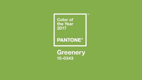
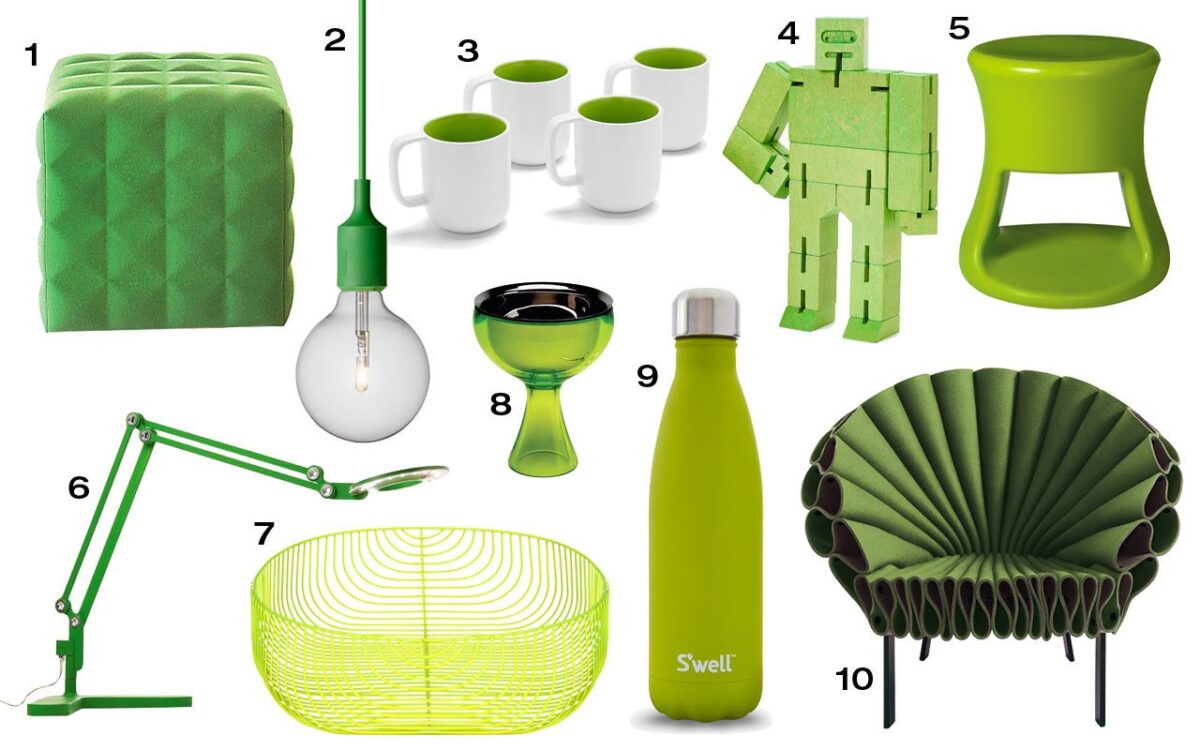
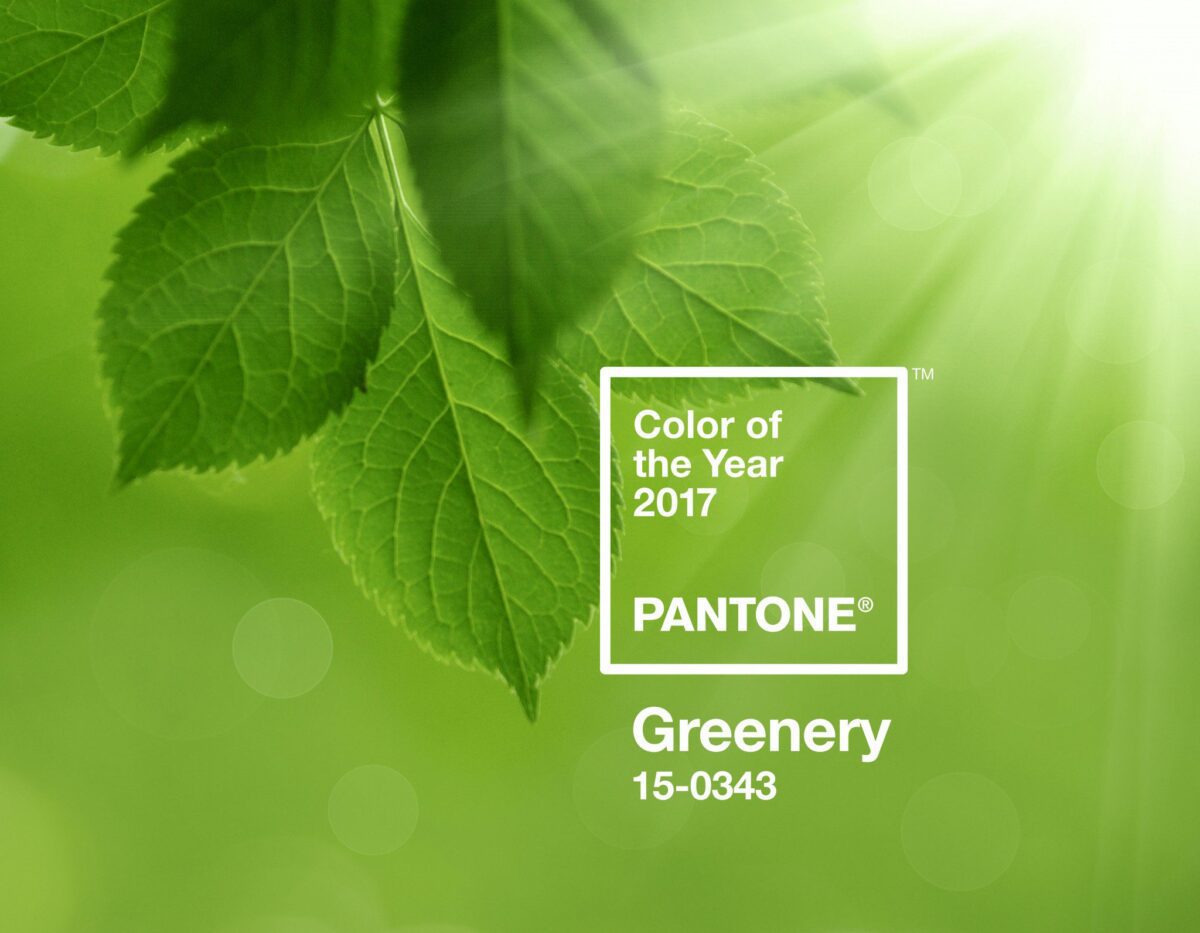
AND THE COLOR OF THE YEAR IS……………………..GREENERY! The shade is Pantone 15 – 0343.
Pantone, in case you don’t know, is the global authority on color and they provide the professional color standards for the design industries.
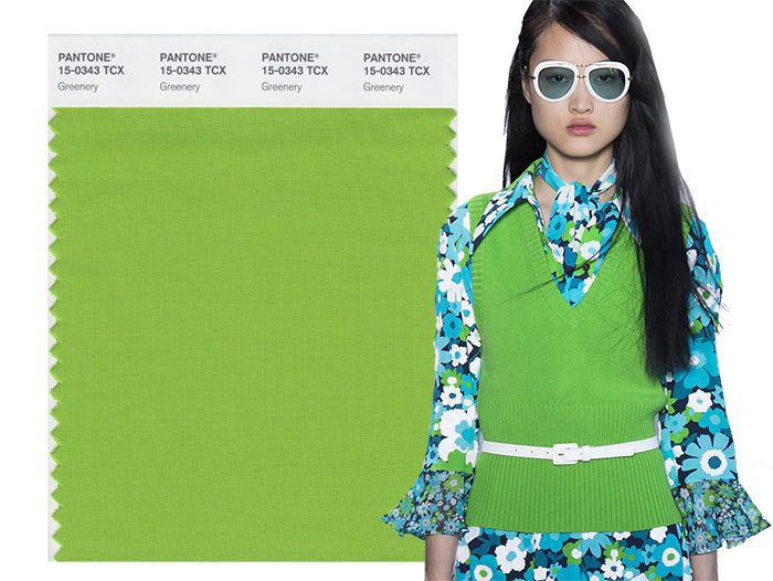
Greenery is a fresh, zesty yellow-green. It evokes the first day of spring when nature’s greens revive, restore, and renew. Greenery’s fortifying attributes signal people to take a deep breath, oxygenate and reinvigorate. Green symbolizes the re-connection we seek with nature, one another and a larger purpose.”
Think about it, Green is forever present in our lives. We see green every day. Grass, trees, bushes and plants are what makes our “outside” world beautiful. Pantone shade 15 – 0343 Greenery is the shade that we think of as life affirming – because in the spring, when the trees first show signs they are coming back to life, they are the color of Greenery. Greenery is nature’s neutral shade. In the world of fashion, Greenery provides a pop of color in accessories, shoes, and bold accented patterns. It is also a great color for clothes.
 In the beauty world, green is thought of as a chic, confident color. It offers a boldness and vitality for the hair, lips, eyes, and nails. It is also a camouflaging base color corrector, which has become a huge trend recently. Green is opposite of red on the color wheel, so green takes away the look of ruddiness in the skin.

This past fall, at New York’s Fashion Week, Pantone saw that the 2017 spring colors used, by the designers,were reminiscent of the colors that surround us in nature. According to the Director of the Pantone Color Institute, Leatrice Eiseman, “the designers used colors that captured the promises, hope, and transformation that we crave each spring.”
The 10 Pantone Colors for Spring 2017 :
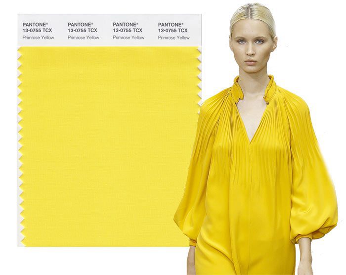
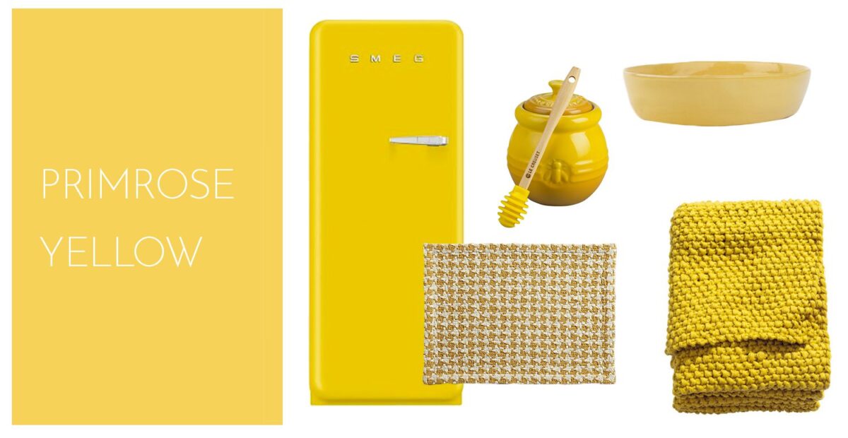
Primrose Yellow – Pantone 13-0755
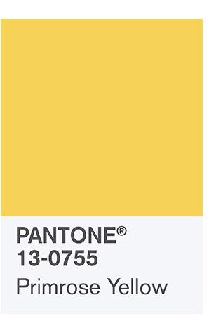
Primrose Yellow makes us think about sunny days, warmth, and vitality. It makes us feel joyful and enthusiastic .
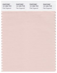
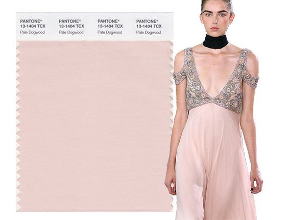
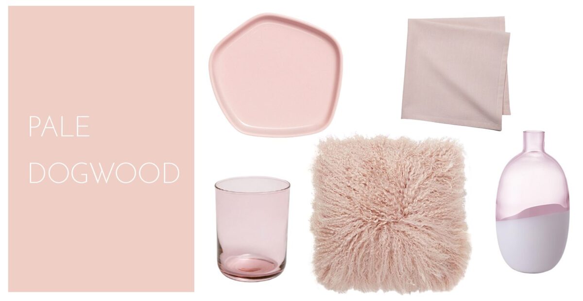
Pale Dogwood – Pantone 1404
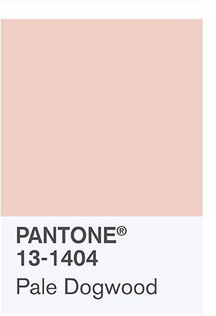
Pale Dogwood is a tranquil, quiet, peaceful shade . It is such a soft, subtle pink that it gives us the aura of innocence and purity.
Hazelnut – Pantone 14 – 1315
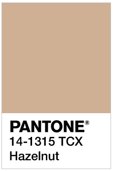
Hazelnut is a shade that actually rounds out the Spring 2017 shades. It is a key neutral for spring.
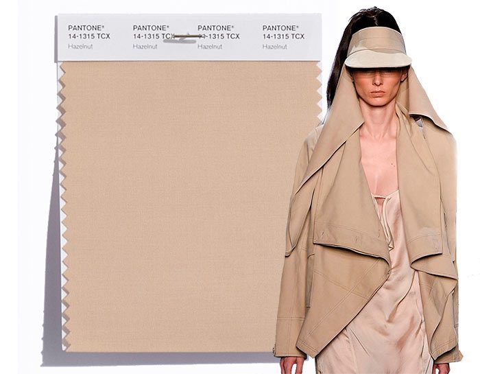
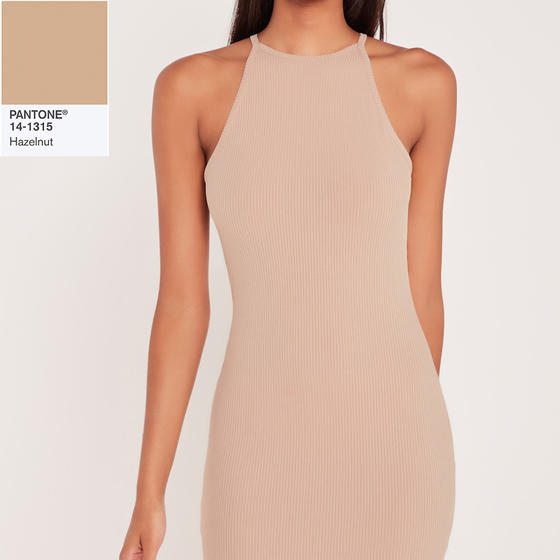
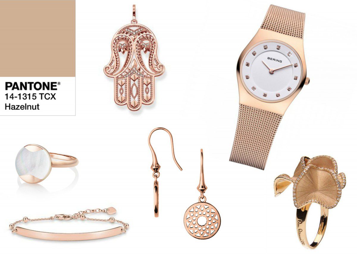
Hazelnut is an unpretentious shade that has inherent warmth, and an earthy quality to it.
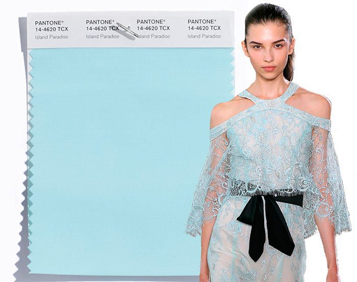
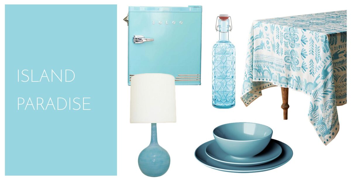
Island Paradise -Pantone 14-4620
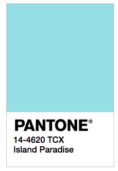
Island Paradise is a refreshing aqua shade that makes us think about a change of scenery.
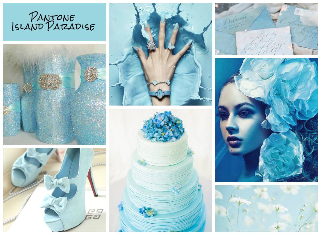
Don’t you just feel like going to the tropics when you see this shade? I feel like we all could unwind with this shade.
Greenery – Pantone 15-0343

Greenery is a refreshing, tangy, yellow-green. It makes us think about exploring, experimenting, and reinventing. It also signals us to take a deep breath, oxygenate, and reinvigorate.
Flame – Pantone 17 – 1462
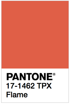
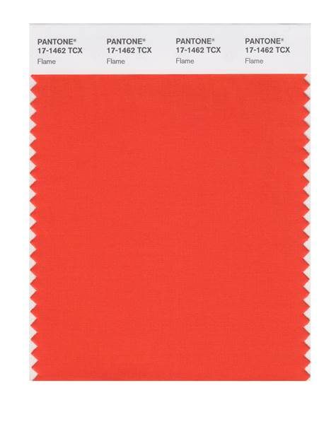
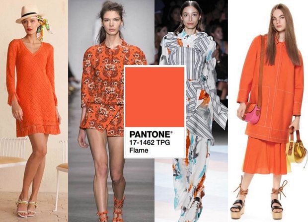
Flame is a red-based orange. It makes me feel fun-loving, and vivacious. Do you think it is too flamboyant?
Pink Yarrow – Pantone 17 – 2034
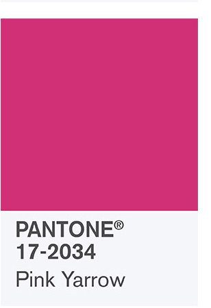
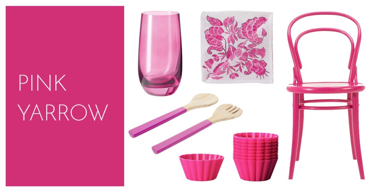
Pink Yarrow makes me feel like I am in the tropics. It is a festive, lively shade, It is really stimulating, don’t you think? Does it lift your spirits the way it lifts mine?
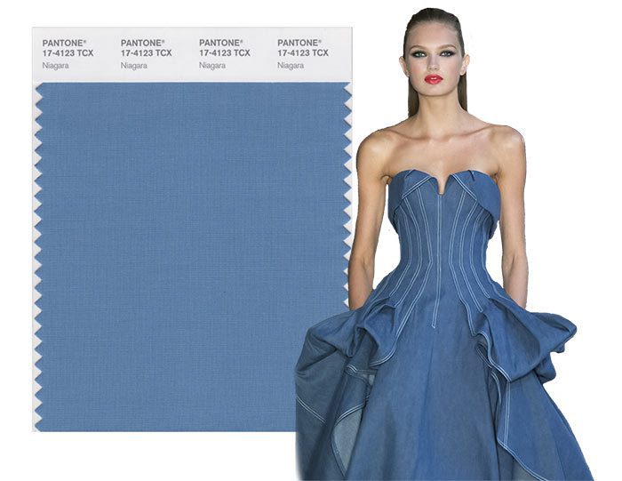
Niagra – Pantone 17 – 4123

Niagra is a denim-like blue.


The vibe I get from this shade is comfortable! It is dependable. It is an easy, relaxing shade. What do you think?
Kale – Pantone 18 – 0107
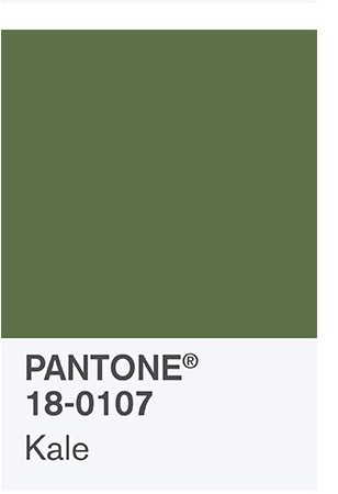
Personally, I have never liked eating Kale, and I won’t even feed it to Claire, my Iguana (although, she might like it) but the color is actually very pretty.

Kale looks outdoorsy and healthy. It conjures up a healthy lifestyle and our desire to connect with nature. Do you like Kale? My friend loves avocados and Kale, she swears Kale salad is delicious. I would rather wear it than eat it!
Lapis Blue -Pantone 19-4045
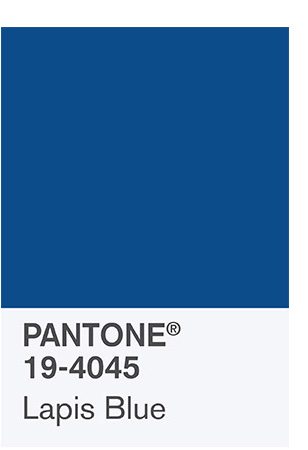
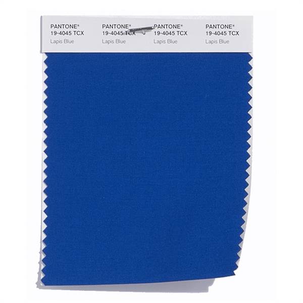
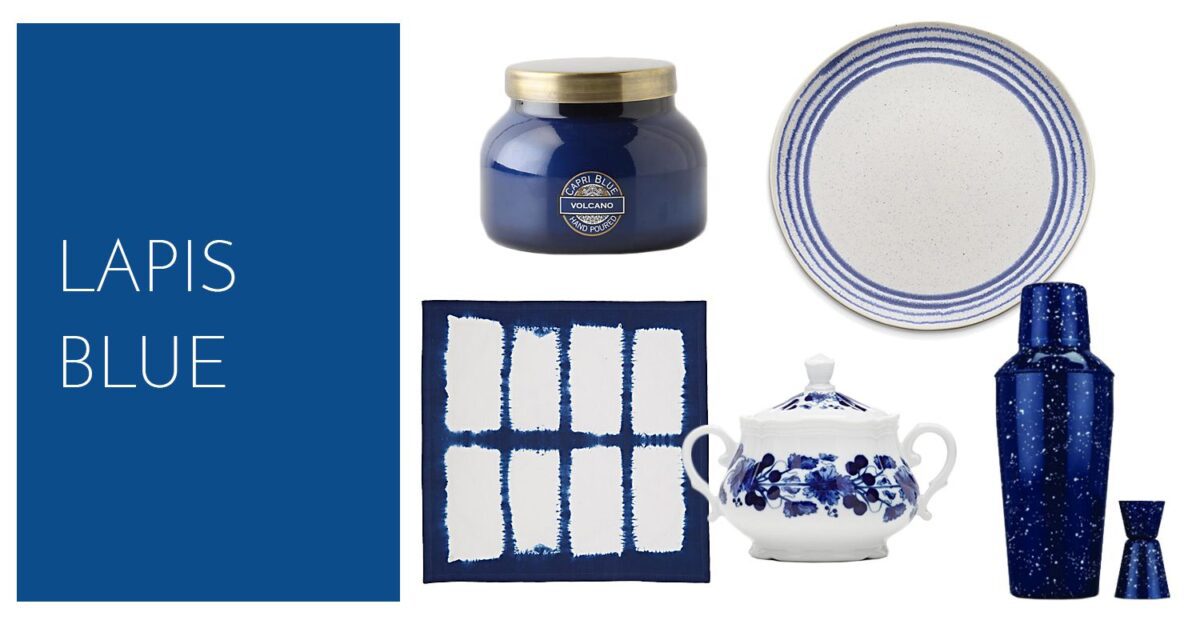

Lapis Blue is energizing. This is an intense shade of blue. I love it! It conveys strength and confidence.

My favorites are Lapis Blue and Pink Yarrow. They are both strong colors. I feel like I am in the tropics when I look at the Pink Yarrow, and I feel strong and confident when I look at the Lapis Blue. Which shades are your favorites for Spring 2017. I can’t wait to see the new spring makeup that will pick up on these shades! I just hope I don’t have to eat Kale in the near future.
You Are Awesome!
xoxoxo
Sookie and Sylvie (who looks good in all the colors because she is a blond!)
Sign up to enter in our free give away, our first glam bag, and you will automatically be entered in our drawing, 2 winners at the end of the month will receive a glam bag and a gift certificate to Sephora- so sign up – you never know when you’ll win!


